Building Latamap
How I built an interactive map and timeline of the political history of Latin America

Background
In May of 2017, I graduated university with a degree in Political Science. Thus marks the last time I have ever used my degree in any practical way. Despite my love for politics, the Spanish and Portuguese languages, and an obsession with Latin American history, I have yet to ever put them to much professional use.
This project is a continuation of that trend! I have now spent hundreds of hours building this website, which I know full well only a handful of people will ever glance at, much less somehow justify the effort it took to create. And I did it on my own time, for no money! Oops. 😅
But that's ok, because I had a ton of fun making it anyways! I encountered all kinds of challenges, both technical and product related, so I will discuss both in depth here for whoever is sick enough in the head to be interested (hi dad!).
That said, I cannot imagine the Venn Diagram of people who are interested in web development and political history is particularly large, so please feel free to skip whichever section you aren't interested in!
Here goes...
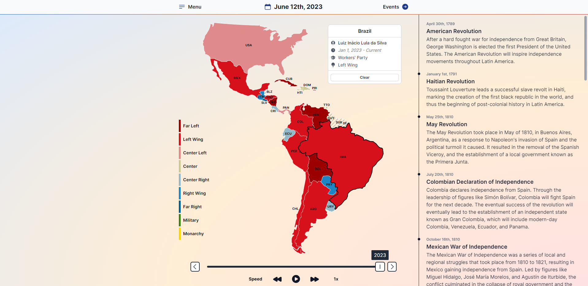
The Product Challenge - How On Earth Do I Get All This Data!?
To make the map work, I decided to record the heads of state of each country since colonial independence. That meant I needed the names of each leader, their country, a date for taking and leaving office, and a political party + its political position. Not so bad, right!?
Wrong. Pretty bad, actually. Fortunately, there are only twenty-three countries in Latin America (well, actually there's some debate about which countries should count as LATAM, and I cut corners a little bit by axing some Caribbean islands, but anyways...). Unfortunately, Latin American history is not exactly known for its, ahh... political stability.
So what I soon discovered was that this whole thing was going to get really messy. Because between the coups, counter-coups, and guys couping the counter-coupers, there are periods in various countries where I had to research the data for like, twenty "presidents" in the span of two years (looking at you, Argentina ಠ_ಠ).
And then to top it off, the whole point of this thing was to visualize the political affiliation of everyone. So I couldn't just write a name and move on. I needed to try (emphasis on the trying part) to find what all these people pretended to believe!
And sometimes it was actually super easy. Paraguay, God love 'em, has elected and re-elected the Colorado Party for like, one hundred years. Back then they were a run-of-the-mill, standard conservative party. And in 2023, they remain so! So it wasn't all hard. But Paraguay was definitely the exception, not the rule.
The rule was... some dude just took power for 126 days in 1867 just because he wanted to, and it's pretty clear from his bio that his political affiliation really just was "I Should Be President Because I Say So". Which, fair point I guess, you did indeed Say So and even Did So, so who am I to argue! But it does make it hard to visualize a meaningful political position on a map in 2023. 😠
So anyways, hopefully it's now very clear how futile much of this project was. Even in the most stable countries, political affiliation is an ever-changing, hotly debated topic! So to actually record clean, meaningful data for nearly 2000 different leaders from the last 250 years was next to impossible.
In the end, all I could do was try my best. All my research was done on Wikipedia and links sourced there, mostly in Spanish because there were fewer useful entries in English beyond the last hundred years or so. Sometimes there was a clear political affiliation I could record; sometimes I read deep into the night about random dictators and their reigns to try to decide where they fell on the political spectrums based on their years in power. And when it was obvious one way or another, I recorded it!
And if not, I cheated by combining "Center" and "Independent" into one big category. Yes, yes, I know they aren't the same thing. "Unaffiliated" or "Independent" is often not at ALL the same as "Centrist". But for the sake of this map, I decided I'd have to call it good enough. And if you are actually interested in anyone in particular, you can always look them up and decide for yourself!
I also ended up adding a "Military" category that I had tried to resist adding since the beginning. "The Military" is listed as the official political party affiliation for hundreds of leaders, and that's about as meaningless a category as "Independent".
But I came to realize, especially in the early history of LATAM, it's actually the most accurate descriptor for a particular kind of President - one who is essentially a figurehead for leading a non-partisan government, but that isn't clearly biased along the traditional right-left spectrum. So I ended up using that for much of the early history when generals were leading revolutions and establishing post-colonials governments, but not actually ruling in some kind of obviously political way.
But it's worth noting I definitely did NOT use it all the time. For instance, Augusto Pinochet technically belonged to no political party other than "The Military". But of course, his rule is one of the most recognizably partisan rules in Latin American history, so I took the liberty of placing him in the far-right cateogry anyways, despite what Wikipedia said.
So to sum it all up... how did I find all this data? Painstakingly! And not infrequently... I didn't! I had to make it up based on my own estimation. As the official recipient of a highly prestigious Bachelor of Arts in Political Science, you'll just have to accept my research as unquestionable fact, like all good historians and scientists must. 😌
The Technical Challenge - How Do I Actually Build This?
Once I had all the data, then I had to actually make it all work, and feel usable! To do so I employed a couple of my favorite technologies.
First, I used D3.js to render the map. There really isn't any better option when it comes to making data driven visualization. There are lots of simpler abstractions built on top of D3, and if you are just building a simple pie chart or bar graph, you should feel free to use one of these abstractions!
But if you want to build something custom, using anything other than D3 just seems like a waste of time. So, once I found the correct GeoJSON data to render the countries and borders in the way I wanted, I used the handy topojson-client library to mold the GeoJSON data into svg-usable feature coordinates.
After that, I did actually do something semi-controversial. Once the map's project is generated with D3, I hand control over to React (in the Remix framework) to build out the components and interactivity. You can absolutely do all of this in vanilla D3 - in fact, pretty much every example I come across does that.
But I like React, and I use it for everything else anyways, so I enjoy handing control of the actual DOM to React instead of D3. From there, I could easily create the color scheme, labels, and interactivity for every individual country how I wanted. Then I hooked it all up to a little state management with Zustand to keep track of the selected date and country in a global location, and voilá!
Worth noting: if you are a Remix fan, you might be wanting to vomit at the idea of using global client state like I did. I also kind of hate it. Buuuut, I tried to make it work with just nested routes and url state, and it just wasn't a good user experience. I wanted users to be able to drag the timeline quickly, and watch the colors change instantly, so writing to the url introduced just a little too much latency to justify.
Lastly, after testing on mobile, I added another library or two to make some elements draggable and toggleable. There's no avoiding that this kind of application is a better experience on desktop than mobile. But there's also no avoiding that people are going to open it on their phones anyways more than they ever do from their computers!
So to make it all fit, I tried to make things as minimal as possible, and allow users to drag and hide elements as needed to make the experience on smaller screens possible.
Conclusion
If you made it this far and you aren't directly related to me, there's almost definitely something wrong with you, but thanks so much for reading!
This project took me several years of on and off work to build from start to finish, so I'd be thrilled if anyone other than myself gets a kick out of it.
If you have any questions, complaints or urgent feature requests, feel free to reach out! In all seriousness, several friends have helped me spot a couple errors in the data, so if you see something, let me know!
You can DM me on Twitter (link below), or send me an email using my contact form (link in the website menu) and I will get back to you right away.